

Block Types & Properties
A block's type affects how it looks and behaves in the editor. Each type also comes with its own set of properties, each having a string value, which further affect the block's appearance and behaviour.
Built-In Block Types
BlockNote includes a number of built-in block types, each with their own set of properties. You can see how they look, both in the editor, and in code using Block objects:
Paragraph
Appearance

Type & Props
type ParagraphBlock = {
  id: string;
  type: "paragraph";
  props: DefaultProps;
  content: InlineContent[];
  children: Block[];
};
Heading
Appearance

Type & Props
type HeadingBlock = {
  id: string;
  type: "heading";
  props: {
    level: 1 | 2 | 3 = 1;
  } & DefaultProps;
  content: InlineContent[];
  children: Block[];
};
level: The heading level, representing a title (level: 1), heading (level: 2), and subheading (level: 3).
Bullet List Item
Appearance

Type & Props
type BulletListItemBlock = {
  id: string;
  type: "bulletListItem";
  props: DefaultProps;
  content: InlineContent[];
  children: Block[];
};
Numbered List Item
Appearance

Type & Props
type NumberedListItemBlock = {
  id: string;
  type: "numberedListItem";
  props: DefaultProps;
  content: InlineContent[];
  children: Block[];
};
Image
Appearance

Type & Props
type ImageBlock = {
  id: string;
  type: "image";
  props: {
    url: string = "";
    caption: string = "";
    width: number = 512;
  } & Omit<DefaultProps, "textAlignment">;
  content: InlineContent[];
  children: Block[];
};
url: The image URL.
caption: The image caption.
width: The image width in pixels.
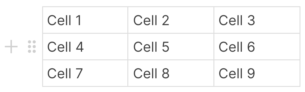
Table
Appearance
Type & Props
type TableBlock = {
  id: string;
  type: "table";
  props: DefaultProps;
  content: TableContent[];
  children: Block[];
};
Default Block Properties
While each type of block can have its own set of properties, there are some properties that all built-in block types have by default, which you can find in the definition for DefaultProps:
type DefaultProps = {
  backgroundColor: string = "default";
  textColor: string = "default";
  textAlignment: "left" | "center" | "right" | "justify" = "left";
};
backgroundColor: The background color of the block, which also applies to nested blocks.
textColor: The text color of the block, which also applies to nested blocks.
textAlignment: The text alignment of the block.
Custom Block Types
In addition to the default block types that BlockNote offers, you can also make your own custom blocks. Take a look at the demo below, in which we add a custom block containing a paragraph with a different font to a BlockNote editor, as well as a custom Slash Menu Item to insert it.
INFO
While custom blocks open a lot of doors for what you can do with BlockNote, we're still working on the API and there are a few limitations for the kinds of blocks you can create.
We'd love to hear your feedback on GitHub or in our Discord community!
Creating a Custom Block Type
To define a custom block type, we use the createReactBlockSpec function, for which you can see the definition below:
type PropSchema<
  PrimitiveType extends "boolean" | "number" | "string"
> = Record<
  string,
  {
    default: PrimitiveType;
    values?: PrimitiveType[];
  };
>

function createReactBlockSpec(
  blockConfig: {
    type: string;
    propSchema: PropSchema<"boolean" | "number" | "string">;
    content: "inline" | "none"
  },
  blockImplementation: {
    render: React.FC<{
      block: Block;
      editor: BlockNoteEditor;
      contentRef: (node: HTMLElement | null) => void;
    }>,
    toExternalHTML?: React.FC<{
      block: Block;
      editor: BlockNoteEditor;
      contentRef: (node: HTMLElement | null) => void;
    }>,
    parse?: (
      element: HTMLElement
    ) => PartialBlock["props"] | undefined;
  }
): BlockType;
Let's look at our custom image block from the demo, and go over each field in-depth to explain how it works:
const FontparagraphBlock = createReactBlockSpec(
  {
    type: "fontParagraph",
    propSchema: {
      ...defaultProps,
      font: {
        default: "Comic Sans MS",
      },
    },
    content: "inline",
  },
  {
    render: ({ block, contentRef }) => {
      const style = {
        fontFamily: block.props.font
      };

      return (
        <p ref={contentRef} style={style} />
      );
    },
    parse: (element) => {
      const font = element.style.fontFamily;
      return {
        font: font || undefined,
      };
    },
  }
);
You can see that createReactBlockSpec takes two object arguments:
blockConfig
This defines the block's type, properties, and content type. It allows BlockNote to know how to handle manipulating the block internally and provide typing.
type
Defines the name of the block, in this case, image.
content
As we saw in Block Objects, blocks can contain editable rich text which is represented as Inline Content. The content field allows your custom block to contain an editable rich-text field. Since we want to be able to type in our paragraph, we set it to "inline".
propSchema
This is an object which defines the props that the block should have. In this case, we want the block to have a font prop for the font that we want the paragraph to use, so we add a font key. We also want basic styling options, so we add the Default Block Properties using defaultProps. The value of each key is an object with a mandatory default field and an optional values field:
default: Stores the prop's default value, in this case the Comic Sans MS font.
values: Stores an array of strings that the prop can take. If values is not defined, BlockNote assumes the prop can be any string, which makes sense for font, since we don't want to list every possible font name.
blockImplementation
This defines how the block should be rendered in the editor, and how it should be parsed from and converted to HTML.
render
This is a React component which defines how your custom block should be rendered in the editor, and takes three props:
block: The block that should be rendered. This will always have the same type, props, and content as defined in the block's config.
editor: The BlockNote editor instance that the block is in.
contentRef: A React ref that marks which element in your block is editable, This is only useful if your block config contains content: "inline".
toExternalHTML
This is identical in definition as render, but is used whenever the block is being exported to HTML for use outside BlockNote, namely when copying it to the clipboard. If it's not defined, BlockNote will just use render for the HTML conversion.
parse
This is a function that allows you to define which HTML elements should be parsed into your block when importing HTML from outside BlockNote, namely when pasting it from the clipboard. If the element should be parsed into your custom block, you should return the props that the block should be given. Otherwise, return undefined.
element: The HTML element that's being parsed.
Adding Custom Blocks to the Editor
Now, we need to tell BlockNote to use our font paragraph block by passing it to the editor in the blockSpecs option. Let's again look at the image block from the demo as an example:
// Our block specs, which contain the configs and implementations for blocks
// that we want our editor to use.
const blockSpecs = {
  // Adds all default blocks.
  ...defaultBlockSpecs,
  // Adds the font paragraph.
  fontParagraph: FontParagraphBlock,
};

...

// Creates a new editor instance.
const editor = useBlockNote({
  // Tells BlockNote which blocks to use.
  blockSpecs: blockSpecs,
});
Since we still want the editor to use the Built-In Block Types, we add defaultBlockSpecs too. The key which we use for the font paragraph block should also be the same string we use for its type. Make sure that this is always the case for your own custom blocks.
And we're done! You now know how to create custom blocks and add them to the editor. Head to Manipulating Blocks to see what you can do with them in the editor.